Dev
Component Preview
A DefaultTemplate-derived page showcasing reusable components and their variants.
Tabbed design samples
Button palette
Documentation navigation
Build navigation of any depth and expand each branch independently.
File tree
JSON tree
Select a bordered branch to show or hide its nested fields.
Collapsible JSON schema
- notification: The notification configuration.
Notification fields
- enabled: Whether notifications are sent.
- delivery: Delivery channel settings.
Delivery fields
- channel:
release-updates - mention_team: Notify all maintainers.
- events: Events that trigger a notification.
Event values
deployment.starteddeployment.finished
- environment:
production


Code block
Hover or keyboard-focus the block to reveal its copy button.
release:
  channel: stable
automatic_updates: trueRich markdown
Markdown text
Collapsible categories
Choose the environment and region used for the next deployment, such as production/eu-west.
deployment:
  target: production
region: eu-westButtons
Save confirmation
Careful — you have unsaved changes!
Modals
Modal variants with separately selectable open and close animations/backgrounds, each containing other reusable components.
Cards
Homepage preset
Default homepage card with hover accent.
Enchanting Table
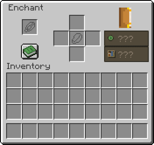
A recipe-driven replacement for random enchanting.
- System
- Recipe based
- Materials
- Lapis and four ingredients
- Result
- One selected enchantment
sm size
Card size variant.
md size
Card size variant.
lg size
Card size variant.
popup size
Card size variant.
Search bars

Inputs and tags
Custom roleMinecraft 26.2FabricJava 25
Controls
Toggle
Locked toggle
Checkmark
Default true/false toggle.
Variants and icons can be mixed independently.
Click to cycle through status states or a custom sequence.
Multi select
TargetsMin 1 · Max 4
Limited multi select
Server softwareMax 2
Locked multi select
Locked targets
Embedded file
 VanillaSquared-Website.zipZIP